Holger Bunk]
[March 3, 2016
Between Painting and Illustration or: Comparing Cathedrals with Beer Mats?
Preliminary Note: This is a kind of virtual essay on „Painting and Illustration” from the perspective of my studio and my teaching. Thus I hope you will understand that next to assured facts, this essay will be influenced by personal bias and opinion.
Antoine Watteau, Billboard of the Art Dealer Gersaint, 1720 / 21 (Source)
und
Europe´s biggest shop for graphic novels, Esslingen 2013 (Source)
In everyday speech, the terms ‘illustration’ and ‘painting’ are used as related but separate categories. Our notion of ‘illustration’ is that of an ‘applied art’: finding pictures for topics that are determined by text and theory. The classical illustration has to quickly visualise something or awaken our attention, but is attributed or subordinated to contents like teaching or information. The category ‘painting’, however, is seen as independent because of the general notion of the freedom of the fine arts. What is not verbalised is that the fine arts are also regulated by a highly competitive and hierarchical scale: ‘art’ can–for whatever reasons–stay insignificant, but it can also sore into record-breaking heights at auctions or at orchestrated blockbuster-exhibitions that are broadcasted on all channels.
Nevertheless, in the modern usage of these two terms a separation into functions is noticeable: the applied and the fine arts roughly correspond to a hierarchy ranging from popular and accessible everyday images to images with an elitist claim of permanence.
In my studio or at my desk, where I prepare myself for painting, I sit in the midst of those collected pictures, illustrations, and paper clippings that have fascinated me somehow. They are working material and not yet ‘art;’ but collected photos and pictures, magazines and books admittedly play a bigger role in my preparations than my own sketches or designs. Similarly, I have seen colleagues living happily in such collections, or students painting from photos or, by now, directly from a screen. There are renowned examples for working with an accumulated picture pool: there is for instance Gerhard Richter’s ‘Atlas.’ A work which is not only published, but also exhibited from time to time, and available online. Found pictures and visual everyday life have a high status in his painting production.
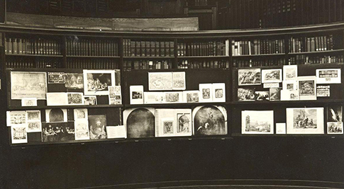
Aby Warburg 1866 – 1929 (Source)
In the art theoretical parts of my education I was caught in the crossfire of teachers of whom one referred to the methodology of his teacher Hans Sedlmayr and the others more to that of Aby Warburg. Contrary in great parts, this could be very confusing for students. At the same time, the skilled and almost sublime craftsmanship of painting played a big role; the fine arts were thus put in opposition to everyday images and a comprehensive visual culture. Sedlmayr describes the phenomena of contemporary art in terms of illness while he sees the occidental Christian tradition, and within that pre-modern figurative painting, as paramount. My former teacher polemicised in “Sedlmayr-Tradition” that his “Warburg colleagues” compared “cathedrals with beer mats.” Apart from this polemics I appreciate Sedlmayr’s demand for an approach that favours the descriptive on the basis of accurate observation.
Aby Warburg, on the other side, lay the foundations for an attitude that I can still see today in artists and art historians—even in the abovementioned Gerhard Richter. Warburg developed a method of a broader and more international iconology, and one that was even more concerned with the everyday image. The focus lies on realising how cultural developments happen and how they make a complex impact on the world. These developments do not only happen within the fine arts. Today many interesting artists work on global comparisons and connections, covering the full range of the visual and aesthetic production and not only on the small part of the visual world that was once declared ‘high culture.’
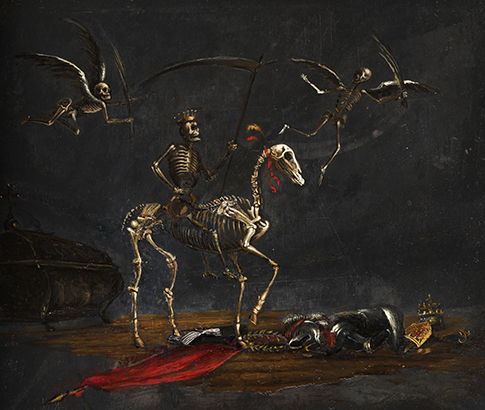
The gaze of the painter with a rather associative approach certainly chooses other focal points than a scientist who has to provide substantiated evidence. But both science and art interpret existing pictures in series in order to examine the origins of pictures or to explain developments. The figurative series that I would like to present here as an experiment, contains work from painters with a close relationship to the graphic arts.
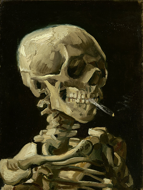
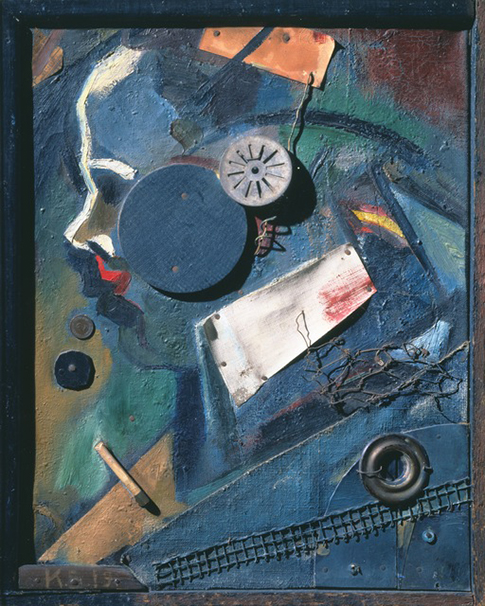
I was interested in the depicted figures because I wanted to know how an encompassing, and ultimately radical, socio-political critique has developed out of moral remonstrance and judgement—parallel to the historical detachment from feudalism. Through ongoing artistic interpretation and stylisation the figure has become more ambiguous and thwarted. The figurative expression ranges from idealisation to grotesque and monstrous phantasms. The possibilities of caricature can evolve from an internal dissonance between heroism and holiness. At the end of this development is the exaggerated character as seen in contemporary images. The changing social hierarchies and the permanent departure from older ideologies are apparent in and through the development of the human figure in images. This series should be seen as a personal attempt to show these thematic changes in figurative art.
Jacques Callot 1592 – ca 1635 (Source)
Jacques Callot (Source)
Leonaerd Bramer 1596-1674 (Source)
Francisco Goya 1746-1828 (Source)
Karl Blechen 1798 – 1840 (Source)
Odilon Redon (Source)
Vincent van Gogh 1853-1890 (Source)
James Ensor 1860-1949m (Source)
Max Ernst 1891– 1976 (Source)
Hannah Höch 1889 – 1978 (Source)
Kurt Schwitters 1887 – 1948 (Source)
Allen Jones * 1937 (Source)
The associative method with its abundance of references is only exemplified by such a short summary of selective figurative depictions. Art historians would certainly rather look at the great historical revolutions and paradigm shifts, such as the French Revolution or the Industrialisation, in order to investigate their impact on the distance between art and mass culture. As a maker of pictures however, I can indulge in a perspective that focuses on a descriptive comparison, on quotations and references, on the subsequent “treatment” through various periods and historical contexts:
Wilhelm Busch 1832-1908 / Holger Bunk *1954
Wilhelm Busch / Neuruppiner Bilderbogen Mitte 19. Jh.
Neuruppiner Bilderbogen Mitte 19. Jh. / Neo Rauch
Concerning one of my own watercolours, I discovered later that a drawing by Wilhelm Busch has to be the unconsciously chosen source material. In the same manner could an iconological comparison investigate the paintings by Neo Rauch, the most famous of the New Leipzig School. In his images a conspicuous accumulation of figures clad in German Biedermeier costumes can be observed and it would be interesting to study their relation to the abundant literature on picture sheets (Bilderbogen) in the GDR. Furthermore, through an analysis of Rauch’s great success with American collectors, the iconology, composition and colour of the US-American superhero comics might leap into view—a visual relationship that could have contributed to his success.
_____
I personally would be interested in compiling even more series of changes, for instance about the pictorial space in painting. Similarly dramatic and significant changes can be seen in the inner organisation of images, in the construction of space on a two-dimensional surface, in framing devices within the picture, rival narratives within the images, layout, ‘Split screen’, film-like sequences and interactive navigation. However, the example of figurative images, with which I will deal now, should sufficiently show that motives go through a complex development process.
Below I want to look at contemporary positions in the arts that, because of their content, refer to popular imagery and illustration. The focus here is on artists who presume that their viewer understands the play with the various layers of visual communication. This opens the possibility for them to enter public debates through visual strategies. The fast changes of media and the procedures of image production are themselves the subject of this kind of art. Painting and illustration benefit from each other or even seem to swap places. In every sense of the word, they reflect on each other.
Marlene Dumas „Models” (Source)
On the occasion of the exhibition of Marlene Dumas’s paintings in the Kunsthalle Baden-Baden, Matthias Winzen commented on the interplay of layers in her painting: in her series “Models” Marlene Dumas has displayed her astonishing ability to revive the made-up, almost masque-like faces of the digitally altered photographs, and to paint them back into faces with emotions, faces that ‘breathe’ on a painterly level. Apparently, magazine photos are transformed back into intense images. As much as I agree with Winzen’s observations on the series “Model,” I am more sceptical towards her new series of artists’ portraits.
Even before Dumas first showed a portrait series of homosexual artists at the „Manifesta 2014″ in St. Petersburg, press reviews critically observed the latest changes in legislation concerning homosexuality in Russia. These portraits seem like late illustrative additions to these articles. The pictures do not develop the same painterly necessity as those that transform high-end fashion models of magazines. A comment on the manipulation of models is more within the competences of painting. With her two series, the South African Marlene Dumas positions herself in current intercultural, political and gender debates. However, when the cause for her work is the painterly gaze, the result of her work is more intense; while when the cause is the expression of her political stance, painting is assigned an illustrating role.
The political and the social, taking on popular topics, earn artists the reputation of esteemed political campaigners and help them to an aura of political commitment. But does it help painting and do we need them as announcers and authorities?
The image of the democratic campaign and the popularity of Barrack Obama, then still candidate for the Presidency of the USA, were shaped globally by Shepard Fairey. His portraits of Obama look like sprayed stencils, and they are far removed from any representative art or painterly expression. Nevertheless, Fairey is not afraid of monumentality or of the effective view from below. His images suggest the strong immediacy and simplicity of political folklore.
Moral and social commitment is doomed to tip over with the political circumstances, just as the connotations of commitment and the popular. With hindsight the Obama-portraits look like applauding the representative of the system. The original hopes and the political details are by now drowned in propaganda.
Shepard Fairey *1970 (Source)
The pride with which the pop attitude is merged with the marketing of fashion is hard to miss. Maybe this is the proof that, at least in the US, art has managed to permeate society. In Europe, however, the consumerism and profit motivation of these endeavours would be questioned. Certainly, one objective is the creation of a community of ‘followers.’ The image, made by a cult artist, obtains the quality of a logo that unites a particular urban lifestyle-scene. The attention of the media turns its contents into a commodity with an expiry date, just as with fashion or newspapers.
A similar and yet antipodal phenomenon is the career of the painter Kerry James Marshall. At the age of 60, the African-American artist has enjoyed enormous success with his exhibitions. On a curatorial level, this success seems like an apologetic afterthought. For how embarrassing is it that so few African Americans surface in the exhibition industry, especially if compared to the music industry? In an interview Kerry James Marshall admitted to have felt like an outsider in the academic world because of a complete absence of black role models.
Kerry James Marshall *1953 (Source)
Consequently, his iconography has its roots in the life of the black communities that express themselves in their own subculture of signs and images—although with the demand for cultural self-determination and the rights of a minority. It is typical that a part of his early oeuvre consists of sequential images and graphic novels that were initially aimed at an audience outside the art scene. In its formative proximity to the popular, the oeuvre of Kerry James Marshall is more authentic than that of all the representatives of the premeditated ‘Bad Painting’ movement. These academicians wanted to prove their proximity to popular culture through illustrations: quotations like copied kitsch post-cards or other deliberately ‘tasteless’ things.
Below the example of a young illustrator: ‘Miss Eve’ is the alias of Evelyn Wangui Gichuhi, a young Kenian illustrator who studied in the classes of Hendrik Dorgathen (Illustration) and Gabriele Franziska Götz (Visual Communication) at the Academy of Arts in Kassel. In her final project she combined sequential art with African advertisement pictures in a booklet that merges word and image and comes with detailed references.
The topic is the construction of a new, apparently correct ‘non-racism’ among ‘whites’ that can do without ‘black’ theoreticians. For this difficult topic full of ethical and political catches and pitfalls she chooses sequential art and completes the book with her texts and references to literature and links. This enables her to make the topic transparent and accessible for her viewers: it turns into an easily accessible booklet that could be the first step into the debate.
Chérie Samba *1956 (Source)
Compared to this work, panel paintings treating similar topics appear rather like hybrids, for example the work by Cherie Samba. Within the subjects they treat, these paintings need to first establish the tradition of the ‘prized picture’ in a collection or a museum. The vast amount of text Cherie Samba uses in the painted image, mirrors the attempt to bridge a gap between the ‘knowing’ and the ‘ignorant,’ between the educated and the unexperienced reception.
Anton Kannemeyer *1967 (Source)
A last African example shows that critical topics in the graphic arts or in illustration can hit more accurately and hurt those criticised more than intricate and unique paintings in an art gallery: Anton Kannemeyers ‘Alphabet of Democracy,’ a loose series of satirical works on paper was also published as a book. It reveals the serious shortcomings after Apartheid and Mandela and portraits the responsible persons in a less than flattering way.
“The Good” have won and rule—but how can you formulate your critique without being reactionary? Based on Hergé, his comic figures seem to inhabit a world filled with a fragmented racism that seems to perpetually reformulate itself. Anton Kannemeyer is part of a team that publishes a political comic magazine. An artistic hand and individuality are not called for in this context. Nevertheless, some of the graphic works of Kannemeyer’s series was shown in exhibitions and has gained cult status in some circles.
I have used his book “Alphabet of Democracy” in one of my newer paintings. The yellow Suhrkamp (German publishing company) volume next to the illustrated book by Kannemeyer is Slavoj ?i?ek’s book “Die politische Suspension des Ethischen.” Numerous violations against ethical principles for superior reasons are enumerated and philosophically classified in this volume, for instance “waging war to end violence.” The book shows to what extent we globally live in circumstances in which inconsistencies have to be endured. Inconsistencies for which we will have to find critical and political remedies in the hope of renewal and improvement.
In Zizek’s extensive analysis of ideology and culture, the British-American ‘Alien’ series exemplifies an interesting phenomenon. In the film of the director Ridley Scott, 5 other directors and no less than 12 screenwriters, the heroine realises that not only the space ships and outer space are inhabited by the ‘other,’ by the scariest adversary and hardest enemy, but ultimately she herself. This story is meant to throw the gaze back on to us. Our desire of drawing up boundaries often blinds us to the fact that our adversary is not so far away as we would wish him to be.
Smog in Beijing, newspaper photograph 2014
An example: When the LED displays on the Tiananmen square, which also hosted a massacre, show a blue sky with white clouds in the midst of smog, it is easy to understand how manipulation by word and image works and we complain about “ideology.” A press photo in our newspaper is printed to “reveal” this, and we are meant to steer clear from the alleged manipulation of the ’other.’
However, as we have seen, we painters and designers are just as much potential players in the game of morals and ideology. The question is how we reflect upon, reveal, share and represent our professional position. Pleas, exposure, ridicule and moral pressure are the instruments with which we distance ourselves from the ‘other,’ which, however, will not suffer to be banished completely. Maybe it is even necessary to cohabit with the identified ‘other’ and to find a possible form of coexistence.
Finally I would like to cross our topic “Painting and Illustration” with the perspective of ?i?ek’s reasoning in which he directs our attention to hybrid forms. To fight the closeness and kinship of painting and illustration, instead of reflecting upon the issue would mean carrying the alleged ‘other’ unnoticed within oneself–to stay in the image of the Alien series. Both extremes have no substance: neither painting set as an absolute, nor illustration that is not informed by knowledge and a respect of the fine arts and the visual cultures, that is following only trends and fashions. (More about this in two postscripts.) For me, to distinguish an allegedly “correct” form of painting from a more open, permeable, conceptual or hybrid form of painting is a genuine shortcoming by the “camp of painting.”
First Postscript:
In the aftermath of the big successes by the New Leipzig School, the painter Michael Triegel was able to gain a position of esteem that became manifest in Kunsthalle exhibitions, in positive reviews in the “Zeit” and in commissions by the Vatican. The craftsmanship is very good, but there is no risk. The non-professionals and the “Neo”-conservatives automatically applaud this kind of painting. For this kind of painting seems to perfectly illustrate that the institutionalised art world lacks the respect for exactly that kind of craftsmanship that would be acceptable for the majority.
I am astounded at the thoughtless confusion of retro-style with the inventive ingenuity of the Renaissance painters. The Pre-Raphaelites or the Nazarenes have celebrated their worship of the old Masters in a similar way: in an unexplained poise between ideology and plausibility. Triegel’s self-promotion with a painting of a covered crucifix seems like a blatant hint to the previously mentioned Hans Sedlmayr and his notion of the “The Loss of the Center.” By way of using this subject matter, the artist calls forth a gap between his work and everyday life, between art and normality, and yet only illustrates a well-known cultural pessimism.
Second Postscript:
In the autumn edition of the magazine “Electronic Beats,” Raymond Pettibon shows two pages from „Political Works 1975 – 2013″ (edited by David Zwirner, Regen Projects and Hatje Cantz) in between reports on Hip Hop and music festivals. In those works from 2007 the artist points at the similarities between Bin Laden’s statements and those of certain republican politicians. From his early booklets in cheap black and white copies to his present-day exhibitions in museums and galleries, Pettibon sticks to the combination of image and text message and an underground feel. Because of his graphic art for albums by Black Flag and Sonic Youth, he belongs to those artists who are acclaimed in both worlds, the music and the art scene.
The magazine “Electronic Beats” portrays him in a colour-stained T-shirt, has him present a critical, investigative stance towards 09/11, and provides him with a critically alternative, independently radical image through the placement in the midst of the displayed music scene. The magazine, whilst free in Amsterdam’s hip bars, has to be bought at the newspaper stand in Germany; it is published by a consortium of Deutsche Telecom and Hubert Burda Media, who will both make money out of successful art and music downloads. It takes an attentive observer to understand this kind of complex blending of contradictory messages and the media that seems to go with the development of contemporary painting.
Originally written for the lecture “Illustrations-Impuls” November 25th 2014, which was co-organized by the Melton Prior Insitute at State Academy of Fine Art and Design Stuttgart Germany (Staatliche Akademie der Bildenden Künste Stuttgart), translated from German by Brigitte Bertram, Tübingen


