Theo de Feyter]
[April 17, 2014
Travelling through Hotel Turgot by cuts. The Art of Wendelien Schönfeld
One rainy afternoon at a friend’s house in Amsterdam I saw a book with a series of colour woodcuts. In the woodcuts the rooms, garden and façades of a former private hôtel in Paris were depicted. In the first print I saw the front door, in the second I entered the building. I saw a grand staircase and a door leading to the interior of the hôtel. In the following prints I went from room to room. I could see people at work – the building houses an art collector’s foundation – the different interior decorations and the accidental light effects of a sunny day. Leafing through the book, the history and present day use of the building unfolded before my eyes. Apart from being beautiful works of art, the prints were a visual description: this is what this building looks like and these are the objects and people one can come across in there.
Hôtel Turgot is an eighteenth-century (1745) private dwelling situated in the Rue de l’Université in Paris. The Hôtel is named after Anne-Robert Jacques Turgot (1729-1791), general inspector of finances under Louis XVI, who lived here during the three last years of his life after his disgrace from royal favour. In the nineteenth century the Hôtel was backed by an apartment block whose entrance was on the Rue de Lille, leaving only a small court yard between the two buildings.
Nowadays the two buildings are one entity with the common main entrance in the Rue de Lille. The former entrance court on the Rue de L’Université is now a garden, walled off from the street. Probably in the beginning of the twentieth century an entrance with a grand staircase was built on one side of the small court yard between the eighteenth and the nineteenth century building. It served as an entrance for the different floors of the Hôtel Turgot.
In 1953 the whole complex was bought by Dutch art collector and art dealer Frits Lugt in order to house the Fondation Custodia, founded in 1947 by Lugt to preserve and study his art collection in Hôtel Turgot. The collection of the Fondation contains European art from the fifteenth till the twentieth century with emphasis on graphics and drawings, applied art, antique books, and artists’ letters and autographs. The nineteenth century building was intended for the Institut Néerlandais, the Dutch cultural center, founded in close co-operation with Lugt.
In 2005 Dutch artist Wendelien Schönfeld received a commission to document the Hôtel Turgot in a series of colour woodcuts. Five rooms, the safe room, the library, the stair case, the entrance door and the back front were ‘portrayed’. The intention was to extend the print and drawings collection of the Fondation Custodia with the work of a contemporary artist specialised in colour woodcut, a technique rarely practised anymore nowadays. The preparatory sketches in pencil and water colours were also acquired for the collection. In 2010 the series of woodcuts and drawings were exhibited in the Fondation. A book documenting the project was published with texts by Van Berge-Gerbaud and Wendelien Schönfeld herself (Hôtel Turgot Publishing House De Weideblik, Varik 2010). This was the book I saw that rainy afternoon.
I have never been at the Fondation Custodia or the Institut Néerlandais, but after perusing the book I did have the impression of having been there. I asked myself, if it would be possible to use an art book as a tour guide. I realised that in that case I must leave the artistic quality of the prints more or less aside and concentrate on the content of the pictures.
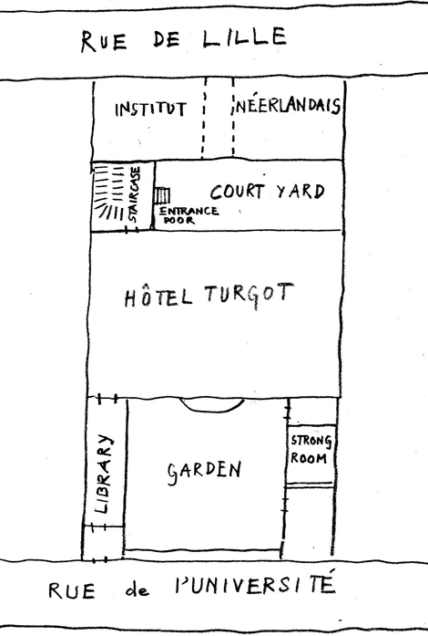
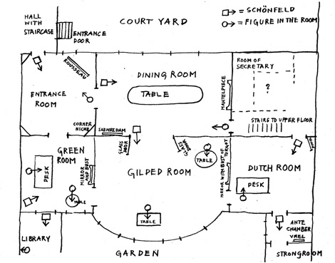
It is only too obvious that figurative art, besides dealing with such abstract qualities like composition and texture, has a content as well. The objects and human beings may be elements in a composition, but they also relate to existing objects and human beings. It is only recently that the abstract and conceptual qualities of figurative art became stressed at the expense of the storytelling qualities. For this occasion I will look at the book not as a book on art, but as part of an atlas. Atlases were (and very often are) collections of maps, pictures and texts describing a region in a comprehensive way. From the sixteenth till the eighteenth century art works could also be part of an atlas and especially in the Netherlands there were many artists specialising in pictures and drawings representing exotic peoples and unknown places. To be able to understand the woodcuts better I also read a little about private hôtels in France in general and about the history of the Fondation and the Lugt-collection in particular. Most important, I interviewed Schönfeld to ask her about what I saw in the prints. Departing from her memories and comments I drew two plans, one of the section between Rue de Lille and Rue de l’Université of which the Hôtel Turgot is part (fig. 1) and one of the Hôtel itself (fig. 2). These plans don’t necessarily have the right proportions, they are only meant to place the information in the text in an architectural context. The book, I hope, will guide my steps and reveal to me the secrets of this unknown place, this ‘Empty Quarter’ in my mind, the Fondation Custodia in Paris.
Theo de Feyter / Wendelien Schönfeld, Plan of section between Rue de Lille and Rue de l’Université (fig.1)
Theo de Feyter/ Wendelien Schönfeld, Plan of Hôtel Turgot (fig.2)
—————————————–
The entrance door
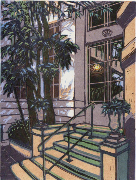
Wendelien Schönfeld, The entrance door (colour woodcut)
The first print shows the entrance door. It is situated in the court yard separating the nineteenth and the eighteenth century building. If you would like to visit the Hôtel you should follow a passage way from the Rue de Lille cutting through the ground floor of the apartment building, housing the Institut Néerlandais, and leading to the court yard at the back of it. On the opposite side of the court yard we can see what must have been the original rear elevation of the Hôtel Turgot. Schönfeld explains that the entrance door is at the right side of the court yard. It is a rather unassuming entrance for a private palace and I am not surprised to learn from the literature on French private hôtels of the eighteenth century that it can hardly have been part of the original architecture, but must have been added later, probably in the early twentieth century. Behind the glass a staircase is visible.
The small railing dividing the steps leading up to the door in halves is a funny detail. Is it there to separate the many visitors of the institutions constantly going in and out in order to prevent chaos? Unlikely. Such a railing is a traditional architectural detail to be found on many stairs of official buildings. It expresses the fact that the entering person is different from the leaving person. Inside he has undergone a change in dealing with a civil servant or some official. The railing is meant to say: “You are entering a public building.”Most probably it was added in the late fifties or sixties after the acquisition of the complex by Frits Lugt when, for the first time in its existence, it acquired a semi-official status.
The staircase
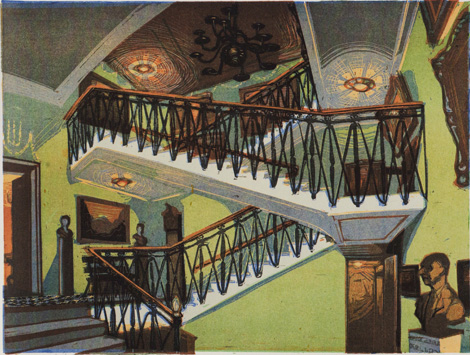
Wendelien Schönfeld, The staircase (colour woodcut)
In the next picture we are inside the building. The first thing we see is the grand staircase leading up to the different floors of the Institut Néerlandais on the right. To the interior of the Hôtel Turgot it is only a few steps up. I can see the open door on the left. Above it is a plaster decoration dating back to the original building period of the Hôtel. When the hall with the stair case was added later this decoration must have been part of the original outer façade. Can it really be plaster? Schönfeld doesn’t know.
She thinks the staircase was built at the beginning of the twentieth century.”‘The style is slightly Art Nouveau. The ceiling lamps very much so.” All in all, the decoration of the hall is rather eclectic. The Art Nouveau ceiling lamps are accompanied by a seventeenth-century style chandelier. Since the decoration of the rooms dates back to the period in which Lugt acquired the building, one can safely assume that the chandelier is a seventeenth or eighteenth century original. Real or not real, such details are not discernible in art. The same applies to the big standing clock, the small pedestalled sculptures and the paintings.
In the far lower right corner of the picture one sees Lugt’s bust portrait with the characteristic protruding nose. Schönfeld: “I should remember who made it, but I don’t. It is the first thing you see on entering. I took care that you can’t overlook it in the print either.” In the background, on the right side of the print, is the door to the basement with elevator, toilets and restoration department. Through the door on the first landing on the left side of the picture we enter the Hôtel Turgot.
The entrance room
Wendelien Schönfeld, The entrance room (colour woodcut)
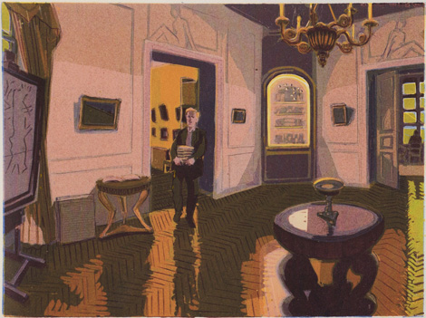
The next picture shows the so-called entrance room. This must be a modern name for the room, because traditionally the entrance of an eighteenth-century private palace was situated in the front part. The French architect Augustin-Charles d’Avilers (1653 – 1701) developed a standard plan for private town dwellings based on symmetry and ´belle décorations´ rather than on efficient distribution of spaces. The architect Jean Mariëtte 1654 – 1742 published the plans (l’Architecture Française, 1727) and since then the plans of d’Avilers for the hôtel particulier became the standard during the whole of the eighteenth century in France and abroad. The hôtels basically all have the same lay out. That is why it is possible to assign original functions to spaces with reasonable certainty. The French names for the rooms in the following are taken from the plans of these two architects.
The back part a French hotel typically consisted of a row of rooms: a central room (salle), flanked by two antechambers and two reception rooms (chambre de parade). In the case of the more example Hôtel Turgot this row would have consisted of a central room with two reception rooms only. So we are entering the Fondation Custodia through one of the former reception rooms of the hôtel.
Whereas the other rooms are the domain of the different curators, art historians and students, this rooms in a way still has its old function of reception and passage room. The stucco decoration above the doors is part of the original eighteenth century decoration. It is further decorated with paintings. In one of the corners we see a niche with what look like small objects. Schönfeld tells me that these are Greek and Egyptian antiquities. She explains that there is one more example of such a corner showcase with small objects. Another corner is occupied by a studio easel with a huge framed drawing. It is visible on the left side of the print. The framed drawing partly covers the only window of the room oriented towards the inner court yard. In the upper left corner of the picture one can see a small part of the window filled with the characteristic yellow-greenish colour, used by Schönfeld in this print to mark, almost as a signal colour, natural light from the outside, filtered by trees. (The same light can be seen in the so-called green room through the door on the right of the picture.) Schönfeld remembers the drawing being a Théodore Rousseau. Rousseau (1812 – 1867) was a French painter of the Barbizon school. She describes the technique as charcoal, heightened with white body colour on prepared linen. It measures at least 150 by 120 cm. She can’t remember the paintings on the wall, but she supposes, because all objects and paintings are from the Lugt-collection, that they are seventeenth or eighteenth century Dutch. To preserve the paintings the rooms all have climate systems. The object between the easel and the small table next to the door is not a portfolio as I thought at first, but a climate installation.
The fluorescent lighting in the corner show cases is hidden behind the wood profiles framing the cases. Schönfeld tells me that the colour tones in this print serve one goal only: to bring out the artificial lighting of this show case. To set off the light effect in a better way she applied as a basis colour, i.e. the colour of the first wood block, a rather dark burnt sienna. It can still be seen in the lines marking the structure of the parquet flooring. In this first block she just cut away the forms of the corner showcase and the reflection on the table. These remain therefore the brightest parts in the final print. As a consequence the rest of the room is darker than in reality. The wall covering, for instance, is really off-white with a pink hue, whereas in the print it is mauve grey. Therefore, the artistic ‘subject’ of this print is the contrast between the natural and the artificial light in the room. We will, however, continue with the bare anecdotal content of the print.
The door on the left leads to the ‘dining room’. The man in the door opening is Wilfred de Bruijn. He is the librarian responsible for the modern reference literature of the Institut Néerlandais and the Fondation Custodia. The commission for the series of wood cuts was not only meant to portray the in- and exterior of the Hôtel Turgot, but also to people the rooms with the employees and students who made use of them. Since there was a limited number of rooms Schönfeld together with director Mària van Berge-Gerbaud drew up a list of art historians to be portrayed in their place of work.
De Bruijn willingly posed for his portrait. This room, however, is not exactly his place of work. He acts as if taking books from the Hôtel Turgot, where they were returned by lenders, to the library in the Institut Néerlandais, his actual place of work. He is on his way from the ‘dining room’ behind him to the door leading to the grand staircase through which we just entered. In his enthusiasm he proposed holding a pile of books and standing on one foot as if walking till Schönfeld finished her sketching. When she told him that it would take her at least an hour to make a few sketches, he saw no problem. But soon he had to admit he had underestimated being a model. The pile of books became heavier every minute, his foot numb, his raised leg went to sleep. In the end he posed five or six times for short periods of fifteen minutes only. His admiration for professional models grew beyond limits. Both De Bruijn and Schönfeld were satisfied with the result in the wood cut.
The Dining Room
Wendelien Schönfeld, The dining room (colour woodcut)
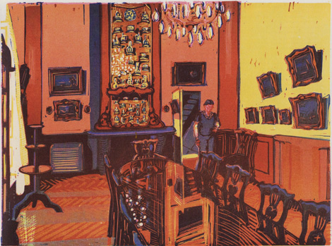
We will now enter the room which De Bruijn came from. The Dining Room would have been the main room, the salle, of the Hôtel, meant for society receptions and festivities. It still has this function, because it is used as a dining room on official occasions and as a meeting room for the board of the Fondation. It is can also be rented.
Every room has its own atmosphere. Schönfeld has tried to render these particular atmospheres by using different dominant colours for each room. In the print of the staircase it is a yellowish green, in the Entrance Room mauve, in the Dining Room red, in the Dutch Room green and brown and in the Vault dark grey. In the print of the ‘dining room’she uses a set of colours for the two visible walls: a warm light red and a pale yellow. “In reality they were one colour,”she remembers, “a light yellowish brown, I believe.”
When she made the sketches she was standing with her back to the wall. The view follows the longitudinal axis of the room. On the left are the lace curtains of the windows overlooking the courtyard, moving in the draught. Lengthwise in the room stands a big conference table with a polished tabletop reflecting the ceiling chandelier and walls. The chimney wall has a decorative, seventeenth century display reaching all the way to the ceiling. It is filled with Delft Ceramics from the Lugt-collection. Or are they Japanese or Chinese? I can’t tell from the prints. (Later I was told that it is Chinese porcelain.) In Lugt’s biography I read that the mantelpiece and display were installed after Lugt bought the Hôtel Turgot (J.F. Heijbroek, Frits Lugt 1884-1970. Een leven voor de kunst. Bussum, 2010).
The bigger picture of those two hanging on the wall to the left of the porcelain display is a landscape by the Dutch painter Emanuel de Witte (1617 – 1692), as Schönfeld remembers well: “A landscape by De Witte is rare. He is primarily known for his church interiors.” The other paintings on the wall are by Dutch seventeenth century painters such as Van Goyen and Saenredam. The three storey tabouret standing in front of the windows does not carry any object. “They leave it empty, because they are afraid it will be pushed over. The room can be crowded, you know, especially when it is rented for festivities.” On the floor, to the left of the mantelpiece is a climate installation again of the same type as we saw in the entrance room.
A figure is entering the room coming towards Schönfeld. She is Marie-Louise van der Pol, secretary of the Fondation. She comes from her work place, situated next to a staircase. We can see a glimpse of it through the door. When Schönfeld deliberated with Mària van Berge-Gerbaud who would be represented in the series of prints, Van Berge thought it absolutely necessary to represent the long-serving secretary. Since it was also decided not to picture the secretary’s small, hidden room, Schönfeld thought of showing her walking through the dining room, which would be empty anyway, being no one’s working place.
The Dutch Room
Wendelien Schönfeld, The Dutch Room (colour woodcut)
We cross the corridor with the small staircase and enter the so-called Dutch Room. Originally this part of the Hôtel would have been reserved for private use, this room being a ‘chambre de retraite’. Schönfeld is standing in the doorway (on the far left of the print the door is visible) looking across the room towards the table behind which Mària van Berge-Gerbaud, the then-director of the Fondation Lugt, is sitting. This is her room. She commissioned the series of wood cuts of the Hôtel Turgot.
This print was the starting point of the series. Its commission was motivated by another series made by Schönfeld in 2004 and 2005, documenting the work places of several museum directors, published in Kunstschrift, a Dutch art magazine. Van Berge-Gerbaud was impressed by the result of this original commission and it led to the follow up commission to document the in- and outside of the H�ôtel Turgot in a series of wood cuts. She remembers, not without pride, Van Berge-Gerbaud, the then-director of the Fondation, saying: “It is very rare that we can lay hands on the drawings which precede the graphic work. The preparatory sketches of artists like Goltzius and Lucas van Leyden of which the final engravings are in the Lugt-collection were all lost to us. Most artists thought that such unpolished sketches had no market value. As a consequence they have very often vanished. With a living artist we have a golden opportunity to acquire the combination of print and sketch.” It is funny that this statement was confirmed by Schönfeld’s attitude towards her own preparatory sketches. She thought of them as just ‘gathering information’, more as ‘information forms’ than as independent works of art. It was only at home, laboriously trying to transfer the information from the sketches into the wood cuts, that she realised that sketches and wood cuts each have their own intrinsic value: the one “solidified presence”, the other “composed memories” as she expresses it.
The Dutch Room was redecorated by Lugt with Dutch seventeenth century furnishings. It is a rather dark room with only one window, giving on to the garden. To the left of this window a small cupboard hangs on the wall. Because it was one of the earliest acquisitions by Lugt the provenance is highlighted by Heijbroek in his biography. It was bought in Amsterdam around 1920 for approximately 300 Dutch guilders (J.F. Heijbroek, Frits Lugt. Leven voor de kunst.Bussum, Parijs 2010, page 112). Lugt always kept it and finally hung it in the Dutch Room. It contains part of his collection of seventeenth century books in original bindings. Lugt worked in this room until his death in 1970. He called it “my art-room”. In one of the photographs in the biography it is possible to discern an edition of the works of Erasmus and Lust-hof der huwelyken (The Pleasure Garden of Marriages) by the popular poet Pieter de Neyn (Heijbroek, page 112). After Lugt died the books were not taken to the library or the strongroom, but stayed where they were. Although they can be used for reference purposes the books are kept in the cupboard and serve in that way as a remembrance of Lugt. On the open door on the far left of the picture, hangs a frame. It leans forward a little bit. Schönfeld tells me that it contains a drawn self- portrait of Lugt. When the door is closed the portrait hangs on the outside. As if it is a shop sign saying, “here is Frits’ Cabinet”.
A very striking element in the room is the black and white marble floor. It is a modern floor put there by Lugt as a typical Dutch element. It probably copies a pattern from a painting. For a long time the black and white marble floor was considered an important characteristic of the Dutch seventeenth century interior by art historians. Investigations by C. Willemijn Fock, a historian of the decorative arts, have proven that such floors were extremely rare in private interiors and only sometimes used in small spaces, such as entrances and corridors. Fock argues that the popularity with artists (and with art historians for that matter) was caused by the spectacular perspective effect: the painting as a showcase for their skills. It is just another example of challenging the supposed realism of seventeenth-century Dutch art. (C. Willemijn Fock, Werkelijkheid of schijn. Het beeld van het Hollandse interieur in de zeventiende-eeuwse genreschilderkunst, in Oud Holland, 112, 1998 pp. 187-246)
Van Berge-Gerbaud has placed her bag on the floor close to one of the legs of her work table. It is of a soft, black material. For the artist this is always a critical detail, because most bags are rather formless as soon as they are placed on floor or chair. The formless object has to be made into a recognisable bag. A bag placed on top of a table or desk is even worse. In that case the artist has the challenge to make a formless object into a recognisable one that does not look out of context and is not blocking too much of the view of other objects. It would have been much harder to depict the chaos on Van Berge-Gerbaud’s desk if an alien object such as a bag had been placed on top of it. Schönfeld: “Luckily she always placed it on the floor by herself. Bags put on table tops are a nasty problem indeed, especially plastic shopping bags.” Through the door in the background we see a small room with a folding fence and what looks like an inlaid floor. It is the antechamber of the strongroom of the next print.
The strongroom
Wendelien Schönfeld, The strongroom (colour woodcut)
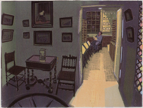
We are in the antechamber. The folding fence is open, so that we can look inside the actual strongroom, situated in the right wing. On the floor we see what looks like an inlay in the form of a compass rose. In older photographs, reproduced in the biography, it is absent, so it is not part of the original decoration. The antechamber is a very modest space: you only pass through to reach the vault. Nevertheless it is richly decorated with antique chairs and a table. Schönfeld remembers there being a painting by Avercamp. She studies the print thoroughly and says, surprised as if it hadnot been made by herself, but by someone else: “You see, in the lower of the two pictures above the table there are a few isolated figures in an almost empty space. Could be the Avercamp. You would expect a skating scene, but it issummer and sunny. Very rare. Although now that I look at it closer, the lower picture on the left has the same scenery. Could also be the Avercamp. I don’t remember anymore.”
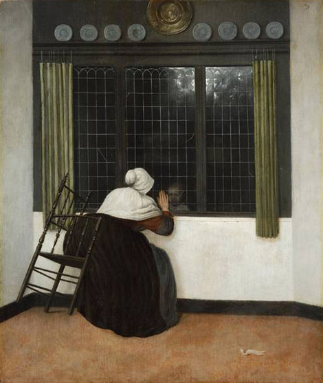
The big picture above the table can easily be identified as the ‘Woman at the window’ by Jacobus Vrel (active around 1654), acquired by Lugt in 1916 during a trip to Berlin. Schönfeld grabs the biography and points it out to me. We see a woman sitting on a chair leaning forward towards a glass window. The chair has only two legs on the floor. Behind the window is the face of a child. It seems as if the woman wants to take hold of the child’s face through the glass. We agree that it is an extraordinary painting: simple and stylised and yet of an intense reality.
Jacobus Vrel, Woman at the window, oil on panel, 45.7 x 39.2 cm., ca. 1650.
On the far right of the print is a modern stained glass door, leading to the garden (the former front court between the wings of the Hôtel). Since the vault is a closed off space and has no exit you have to go through this door and across the garden to reach the other rooms of the wing.
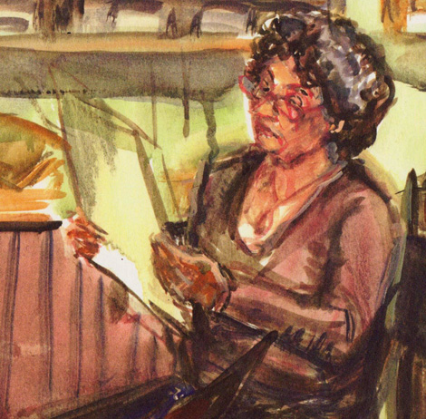
Schönfeld has sketched this scene standing in the door opening between the ‘Dutch room’ and the antechamber, looking along the longitudinal axis of the wing. In the strongroom Corinne Letessier is sitting, who is responsible for the restoration of art works on paper. She is examining a sheet. In front of her are three portfolio stands. “The likeness is very good,” Schönfeld says. “I made quite a few sketches of her. She was a very patient model. But I am also very satisfied with the ‘translation’ from sketch to woodcut in this case.” The sketches show that Letessier must have posed for a long time. Although in the print she is supposed to be holding some rare antique print or drawing, she is not wearing gloves as one would expect of a restorer. Instead of holding a vulnerable print, she was probably holding some list or other paper and didn’t bother about gloves.
Wendelien Schönfeld, Corinne Letessier in strongroom (detail), watercolour and pencil on paper.
The strongroom is the heart of the Fondation. Here the most valuable items of the collection are kept, the engravings, drawings, etchings and letters by Dürer, Goltzius, Rembrandt, Andrea del Sarto, Canaletto and many others. Schönfeld explains that behind Letessier a panel with a collection of antique frames is hanging. The panel is depicted in the biography. I can see that some of the frames contain miniature portraits and I learn that one is a portrait of Anne-Robert Jacques Turgot after whom the Hôtel is named. It was made by Charles-Nicolas Cochin (1715 – 1790). In front of Letessier are the portfolios and books in which drawings and prints are traditionally kept in ancient collections.
The Gilded Room
Wendelien Schönfeld, The Gilded Room (colour woodcut)
We return to the main building and take up the position Schönfeld took when drawing the so-called Gilded Room. She stands in the doorway between Dining Room and Gilded Room. From her standpoint Schönfeld has a full view into the room. This is the largest room of the Hôtel. According to the standard plans for private dwellings, drawn up by d’Avilers and Mariëtte, the entrance hall with grand staircase of the Hôtel Turgot should have been here. The main entrance doors were where now the bay window is, in the center of the picture. The Gilded Room takes its name from the gilded architectural details, such as the sunken frame between wall and ceiling and the capitals of the pilasters. The names of the rooms are modern. They were invented by Lugt and by others after him.
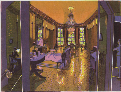
The dominant colour in the print of the Gilded Room is a gold ochre. The complementary colour in this print is purple. The light in the Gilded Room (and in the print) has two sources. First there is the daylight coming from the garden through the triple bay window. It is yellow-green, the ‘signal colour’ Schönfeld regularly uses to represent daylight filtered by trees. The second source is the electrical lighting: vertical stave-like wall lamps placed high on the wall, lamps hidden in the sunken frames at the ceiling and big, standing lamps on the mantelpiece. One might add a third source of light, the bright computer screen on the left part of the print. It is exciting to see the mix of natural and artificial light, electrical or electronic, depicted in a traditional medium such as the colourwood cut. Schönfeld is quite good at it.
In the print four figures can be detected. On the right we see the reflection of Schönfeld sketching at her easel in the glass door. The Dining Room behind her is shrouded in darkness. On the left behind the other half of the door Eveline DeNeer, a student of art history, can be seen working at a round table behind her computer. She is not a reflection. At the time DeNeer was apparently doing archival work: Schönfeld remembers her occupied with filing cards all the time. The third figure sits in front of the bay window, behind her desk, and with full view of the garden. She is the art historian Rhea Blok, specialised in collectors’ identifying marks. These marks are an important part of the Lugt collection. The fourth figure is Michel-Etienne Turgot, the father of the name-giver to the Hotel and an important eighteenth century magistrate. He is present in the shape of a bust on the mantelpiece. His long wig can be seen reflected in the mirror.
The Green Room
Wendelien Schönfeld, The Green Room (colour woodcut)
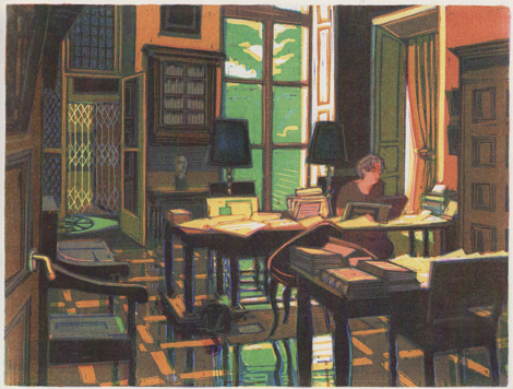
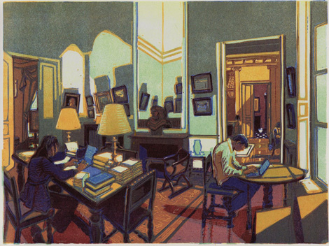
In the Green Room, Schönfeld took position in the corner, which at the same time is the corner of the house. The name of the room derives from the green wall covering. On the right side of the print one sees the flight of rooms in the rear section of the Fondation: the Green, the Gilded and the Dutch Room. In the Gilded Room one sees part of the figure of Mrs. Blok peeping out from behind the door. At the far end of the vista the characteristic ‘Old Dutch-floor’ of black and white marble tiles identifies the Dutch Room. On the left of the print the Entrance Room is visible through the open door. The big framed drawing of Théodore Rousseau on the easel in that room covers part of the only window. In the print of the Entrance Room the Green Room is visible on the far right with a figure in backlight. The same figure is still working arduously at his laptop in the print of the Green Room. He was a student-trainee working ‘on letters of some landscape painter’ as Schönfeld only vaguely recalls. She doesn’t remember his name. His presence at the Fondation was not foreseen during the period Schönfeld would be working there and his depiction in the series of wood cuts was therefore not explicitly agreed upon. He turned out to be, however, a useful element in the composition of two prints and is, in spite of his anonymity, more present than others. Opposite his work place is the garden window. He doesn’t look at the view absorbed as he is by his laptop. The main occupant of this room, sitting at her desk on the left, is Marie-Cécile Tainturier, art historian and one of the curators of the Fondation. She is a specialist in seventeenth-century Dutch art.
This print is quite complicated as to its perspective. The Green Room itself shows all of its four walls: two directly and two reflected in the mirror. At the same time three other rooms are visible through the open doors: on the left the Entrance Room and on the right the Gilded and the Dutch Room. In addition, in the Gilded Room the chandelier and the opposite wall can be seen as a reflection in the mirror. The whole print is a genuine mirror cabinet with its play of perspective and reflections. The sunlight structures the composition of the print with an interesting rhythm of bright and dark parts. The bust on the mantelpiece in the middle of the print seems to be the pivot around which everything revolves.
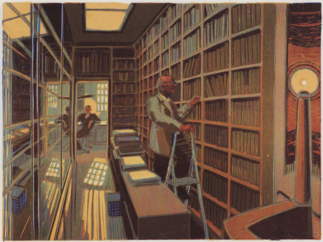
The library
Wendelien Schönfeld, The library (colour woodcut)
From the Green Room we enter the left wing of the Hôtel Turgot, originally housing stables and service rooms. The corridor-like room now serves as the Fondation library. Schönfeld stands in the door opening just within the room. The pole ending in a lamp in the right of the print is the newel post of a staircase, leading to the basement. The lamp is burning. This is a rather dark room with only a modest roof light.
On the right of the room are open book shelves, on the left shelves behind glass. In here are kept the antique books dating from before 1800, the reading room and library with secondary literature being in the building of the Institut Néerlandais. At the far end is a small room flooded in light. The contrast with the dark library room is striking. The light comes from a window overlooking the Rue de l’Université. It looks as if the window has old-fashioned lattice-work which divides the window in many small ones, but Schönfeld suggests a grating. “I think I remember it being a grating. I am not sure though, but it would make sense to safeguard the library in that way.”
To let the light of the lamp, roof and sun shine out clearly the colour of the first block of this print is a dark one, in which only the white parts in the window and its reflections on the floor and in the glass and the light bulb in the lamp on the turn style were left open.
There are two human figures in this print. One is standing on a small stepladder before the open shelves. It is Peter Fuhring, one of the ‘scientific advisors’ of the Fondation, specialised in collectors’ identifying marks. The other is in the small room at the end of the library. That is Hans Buijs, the conservator of old books, autograph letters and manuscripts. He is sitting at his desk, half turned in the direction of where Schönfeld stands and is looking in her direction. Schönfeld remembers that Fuhring posed willingly and patiently, standing on the stepladder, acting as if he was looking for a book on the shelves. Buijs on the other hand hardly took the time to pose. “I was only able to draw him in this position once. I think he didn’t like posing. He always took care to be very busy when I was there.”
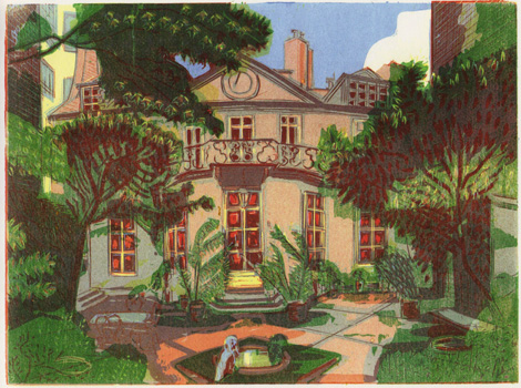
The rear façade
Wendelien Schönfeld, The rear facade (colour woodcut)
The last print in the series depicts the garden façade. This was the former grand front façade of the Hôtel Turgot, originally visible from the Rue de l’Université. Right and left, half covered by the trees and bushes, are the wings housing the strongroom and the library, respectively. Further in the background are the high walls of neighbouring houses. The Hotel Turgôt is completely closed in by modern, i.e. nineteenth century, apartment blocks. The round bay window of the Gilded Room (the former entrance hall or ‘Grand Palier’) sticks out into the garden, which is fenced off from the street. There is a pool in the centre foreground. On the rim sits a stone pelican. “Or was it iron?’”
End note:
Can an art book be used as tour guide? I cheated slightly by answering this question which I posed at the beginning. In fact I was not exclusively looking at the wood cuts, but in trying to assign functions to the rooms and interpreting the orientation of the building – what is front and what is rear – I read a little on the site as well. The biography of Frits Lugt by J. F. Heijbroek added much to my knowledge of the history of the interior decoration of the building.
Very helpful was the book about private dwellings by the French architect Jean Mariëtte, published in 1727. He made use of the theoretical plans designed by Augustin-Charles d’Avilers (1653 – 1701). The plans became the standard for the eighteenth-century hôtel particulier in France and abroad. For that reason the hôtels basically all have the same lay out. That is why I thought it would be possible to assign original functions to the spaces of the Hôtel Turgot with reasonable certainty.
When I, however, submitted my text to Mària van Berge-Gerbaud, former director of the Fondation Custodia during Schönfeld’s working period and longtime resident of the hôtel, she maintained that in the case of this modest private dwelling the lay out deviated from the standard. According to her the entrance of the hôtel always was located at the side of the Rue de Lille (ancient Rue de Bourbon), i.e. in the hall with the grand staircase which I took as a twentieth-century addition. The stables were located there as well. She remembers the small railing dividing the steps leading to the entrance door being placed there in the late nineties of the twentieth century to accommodate elderly people. The wings housing the strongroom and the library would have been built in the nineteenth and the twentieth century. Even if it is not quite clear whether these wings were rebuilt or newly constructed, it is obvious that Van Berge’s conclusions differ completely from my interpretation of the orientation of the building. She pointed out that my ‘original front façade’ is and always has been the back façade.
So can an art book be used as a tour guide? Possibly, when you let art speak for itself.
